Who would’ve thought that a genre that emerged from the mix-and-match of jazz, rhythm and blues, and country along with electric elements would help shape the music culture as it is now today and offer a cathartic way of artistic expression? Yes, we’re talking about rock music. Birthed during the rebellious and expressive eras of the 1940s-1960s, rock music earned its reputation of being a subversive and proudly liberal music genre, being revered especially by the teens and ‘misfits” of society.
Today, the rock genre isn’t just known for its incredible lyrical and musical genius, but also the unique and edgy form of artistic expression. While it initially earned the title ‘The Devil’s Music’, it eventually became the genre that heavily inspired graphic design styles today.
There has always been a symbiotic relationship between graphic design and music, with album covers as a visual outlet for the harmonies
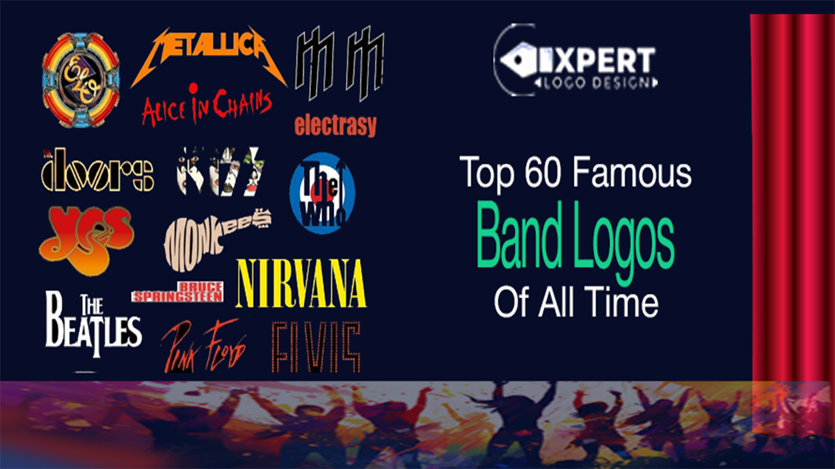
Even if you aren’t too heavy on the hardcore metalhead scene, we can bet you would be able to recognize a couple of these incredible rock band logos from a mile away. Whether you’re an aspiring band about to start off or a graphic design lover who’s looking to expand their artistic approach, you can use this list of our top rock and roll band logos to design the logo concept of your ‘heaviest’ dreams 60 Iconic Rock Band Logos to Inspire Your Own
Checking out iconic rock and roll band logos is a great way to figure out how to highlight symbolism, meaning, and personality in design concepts. You can get started with this by taking a look at these 60 remarkable rock band logo designs:
1. The Beatles
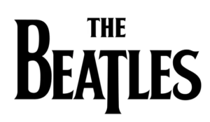
Originally designed by Drum City shop owner Ivor Arbiter and refined by sign painter Eddie Stokes, the Beatles band logo was first seen on Ringo Starr’s drum kit. The logo is a straightforward but powerful example of a type design, with its oversized letter B and elongated letter T.
2. Rolling Stones
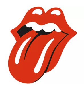
Can you believe that in just £50, one of the most renowned classic rock band logos came to being in 1969? Inspired by the lips of Mick Jagger in a pop art design, this logo design highlights the anti-authoritarian values of the band with the bright red color and style.
3. Korn

The iconic backward R in this logo came from Toys ‘R’ Us, a store several of Korn’s band members previously worked for. The distinctive lettering has a handwritten vibe courtesy of the band’s frontman Jonathan Davis.
4. Pink Floyd
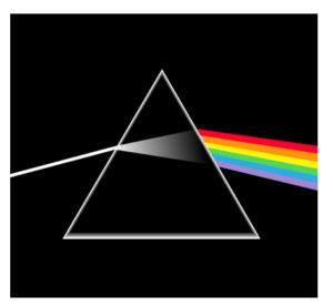
Colors and edgy-ness often don’t go together, but Pink Floyd will have you thinking otherwise. Their most iconic band logo comes from their The Dark Side of the Moon album. Featuring the illustration of light being refracted through a prism, it’s meant to embody the lights they use for their live shows.
5. Red Hot Chili Peppers
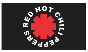
Being one of the most famous 80’s band logos, RHCP’s logo derives its uniqueness from the Franklin Gothic style, which is a heavy-set sans serif font.
6. Metallica
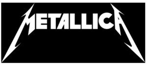
Created by lead singer James Hetfield of the band, using a font known as Pastor Of Muppets, Metallica’s famous metal band logo is easily recognizable worldwide. The vertical lines of “M” and “A,” which are stretched out to both sides, represent flashlights and capture the essence of this legendary band.
7. Daft Punk
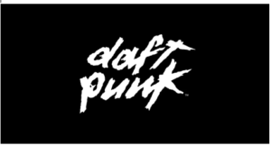
Starting out with the French House Movement, the band proudly owns one of the coolest 90’s band logos. This iconic logo was designed by band member Guy-Manuel who was inspired by a poster of the film Thief (1981).
8. Muse
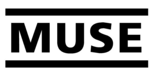
This amazing band logo of Muse uses the Frutiger 65 Bold font style, which captures the brand’s essence in its simplicity. The one or two lines are often seen framing the typography to add to its overall structure
9. Gorillaz
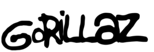
Gorillaz’s use of a graffiti-inspired typeface is a well-known example of how effectively a font choice can convey your band’s identity.
10. Nirvana
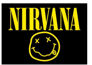
Probably seen more on t-shirts than any other design logo ever, the Nirvana band logo design is the perfect mix of edgy, unique, and vibrant. This iconic band logo design features a smiley face and an Onyx typeface, with colors that contrast beautifully.
11. Oasis
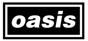
Another great example of being simple yet recognizable, Oasis’s band logo was designed by using Helvetica Black Oblique font style in lowercase.
12. AC/DC
Following the literal meaning of the band name, the logo has an electric bolt design to separate the letters AC and DC. The font style used for this is Squealer, which has a distinct geometric and edgy appearance.
13. Linkin Park
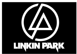
Though the band often went through quite a few redesigns, its most famous logo remains the round initial one with the letters L and P inside.
14. The Ramones
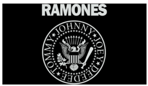
Another beautiful logo design features an eagle with an apple tree branch and a baseball bat in its talons, this logo design captures the essence of an American experience.
15. Blur
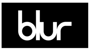
Often seen in either black or white, this rock star logo is text-based. The characters are without any spaces, which portrays a connected silhouette illustration.
16. Paramore
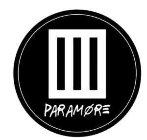
Even after going through several redesigns, Paramore still has one of the most iconic emo band logos in the industry. The design features three simple lines or bars with a circle to represent each member’s connection to the band.
17. Buzzcocks
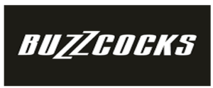
The Buzzcocks Logo design goes a long way back. The band members teamed up with a student from Manchester University to design the logo. The designer used the Font Compacta and designed the letter Z to make it resemble thunder or lightning.
18. Bon Jovi
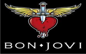
Bon Jovi’s rock band logo can be recognized from a mile away. The design is simple with a dagger going through a heart which seems fitting for a rock band such as them.
19. Depeche Mode
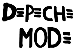
This design from Depeche Mode is heavily influenced by punk rock and features a black-and-white concept. Their logos have featured handwritten font styles in their designs.
20. Aerosmith
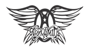
Aerosmith’s famous 80’s rock band logo features wings on a steering wheel with a star on it. It’s also a reference to a previous album released by them where the logo was first seen.
21. The Who
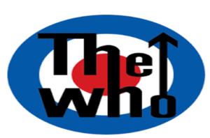
The Who’s logo represents their trademark image: Masculinity and Unity. The text is in a blue white and red background, with the logo similar to that of an archery target.
22. The Clash
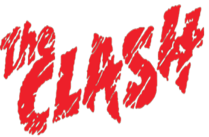
Despite having a messy overall look, The Clash’s logo design matches their music genre and artistic style. The design of the logo focuses on incomplete strokes expressing the rebellious nature that punks love.
23. Guns N Roses
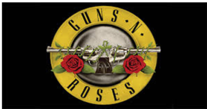
Guns and Roses’s classic band logo design with the red roses and the guns side by side gives off an edgy yet expressive image that is translated well through the vibrant colours.
24. Weezer
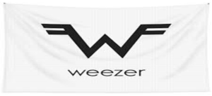
Talk about simple and to the point. The flying W, designed by Patrick Wilson, has two f’s conjoining it with the w standing for the band name’s first letter.
25. Pearl Jam

Featuring a bolt of red lightning between black all-caps on a white background, Pearl Jam’s newest logo is simple yet visually appealing.
26. Kavinsky
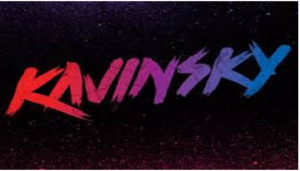
Everyone loves Kavinsky, and their logo, even more. Known for its retro font, the logo awakens the nostalgia of the 80’s movies and music genre.
27. Anthrax
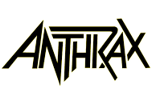
Created by lead guitarist Danial Alan Spitz, the geometry of the letters in this rock band logo is very unusual, with the letters laid upon each other.
28. Radiohead
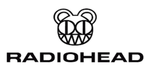
Originally started as a drawing of an artist’s daughter drawing, it quickly became the band’s famous logo with the addition of the band’s name on the design.
29. Yes
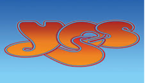
Featuring a trippy and colorful typeface, Yes’s logo embodies a Graffiti style and matches the band’s identity.
30. The Killers
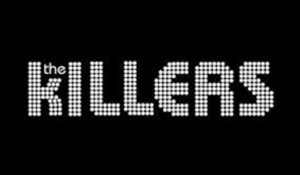
The Killer’s rock and roll logo goes for a retro look. With flashing lights forming the band’s name, this logo design is well-loved by their fans.
31. Van Halen
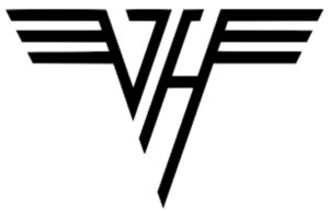
Van Heln revamped their design to pay homage to their origins with the original color palette of black on white and the ‘OG’ style of their debut.
32. System of a Down
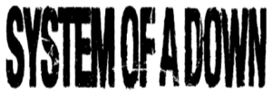
System of a Down’s rock logo is definitely on the list of some of the famous rock band logos. The faded effect adds to the overall aesthetic of the design’s typeface.
33. Blink 182
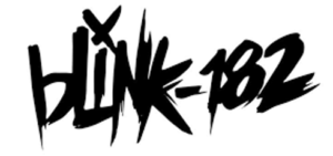
While the origins of the number in the logo remain unexplained, the design of the logo embodies the connection to the punk rock genre and is one of the well-loved punk band logos.
34. The Smashing Pumpkins
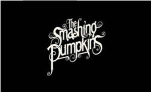
Passing Adobe Caslon Regular in small caps through some additional touches, you can easily tell this 90’s rock band logo belongs to The Smashing Pumpkins with just the font.
35. Misfits
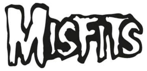
With the logo originally a tribute to a film, the aesthetic of the design with its too-large-to-miss fonts exactly matches the band’s identity.
36. KISS
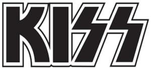
This one from KISS is one of the most iconic logos of all time. The font is called Die Nasty with the ‘S’ shaped like lightning making it instantly recognizable.
37. The Grateful Dead
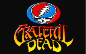
Featuring a bolt going through a skull, this can be called ‘The Rock Logo’. Designed by Bob Thomas, their logo is often seen in red white, and blue with the bolt signifying enlightenment in the band’s music
38. The Libertines
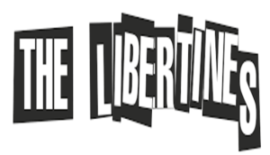
Indie band logos are tricky to design, but The Libertines’s logo can be called one of the best. Designed in the CorelDRAW® format, the newspaper cut-paste effect in the logo is something we all love.
39. My Chemical Romance
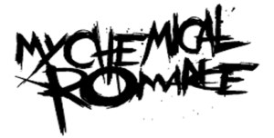
Featuring a scratched and edgy logo design, My Chemical Romance’s logo has been the highlight of the early to mid-2000s.
40. ABBA

ABBA’s band logo is an acronym for its band members’ first names. It features a very simple logo design with the letter Bs reversed, and the letters being a mirror reflection of each other.
41. Sex Pistols
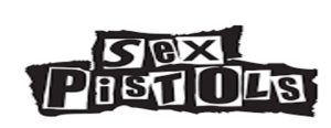
Created by artist Jamie Reid, the design of the logo features a blackmail or ransom-style font which is instantly recognizable for its overall look.
42. Queen
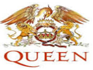
Made by legend Freddy Mercury himself, the design embodies the zodiac signs of the members with a phoenix and a crown. The typeface in the design has very sharp diagonal serifs with a red palette.
43. Iron Maiden

Coming back to its original concept, the design for Iron Maiden features a new darker shade of red with the letters R, N, and M having sharptails.
44. NIN
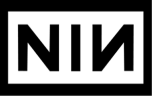
Nin’s minimalist design is strong and uses a sans serif typeface with the letter N being inverted.
45. Run the Jewels
Created and based on an 80’s action film’ Fighting Stance, the design was made by artist Nick Gazin
46. The Monkees
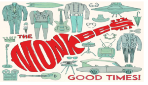
Created by their show’s hype man Nick Lobianco for $75, the design of the guitar-shaped logo embodies the music for which the Monkees were known.
47. Unkle
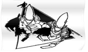
Created by artist Futura, the band’s logo design has a point-headed and scratchy alien character on a triangle that embodies the band’s first album, Pysence Fiction.
48. Led Zeppelin
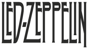
Truly an example of being simple but recognizable, this design has a simple black-on-white wordmark with an offbeat customized font with all of its letters being different.
49. The Doors
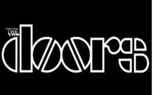
Another beautiful design featuring two different styles, The Door’s logo styles it’s ‘THE’ in an italicized art Nouveau style, and ‘Doors’ styled in a lowercase but bold typeface.
50. Fall Out Boy
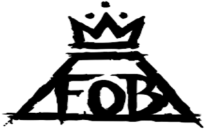
A triangle design with a crown on top cut into a trapezium with the words FOB being in a classic serif typeface, you can detect Fall Out Boy’s edge even from afar.
51. Dream Theater
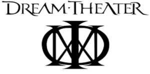
Named “The Majesty Symbol”, Dream Theater’s logo was reworked by Charles Dominici being heavily inspired by Mary, Queen of Scots’s mark.
52. Avenged Sevenfold
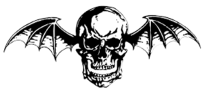
An icon in the music world, Avenged Sevenfold’s design of the skull with wings attached to it is nicknamed The Deathbat among the rock band logo lovers.
53. The Dead Kennedys

Famous for its stylized abbreviation with geometric lines, the design has a black and red-white palette where the colors stand for different meanings.
54. Public Image Ltd
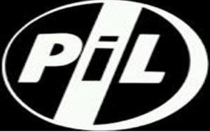
Created by photographer Dennis Morris back in 1979, the design has the words ‘PiL’ in a black and white typeface on a metal canister.
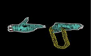
55. Rage Against the Machine
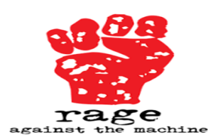
Famous for its revolutionary ideals and music, RATM’s band logo design with a red-colored hand raised in protest perfectly encapsulates the band’s ideology.
56. Slipknot

Designed in a custom handwritten font, the black bold case letters in this rock band logo are placed in an up-and-down line with uneven contours.
57. The Kinks
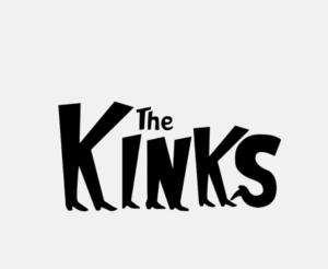
The letters of The Kinks’s logo design end as feet in the comic sans typeface, which all work together to give off a funky yet classic vibe this band has always been known for.
58. Arctic Monkeys
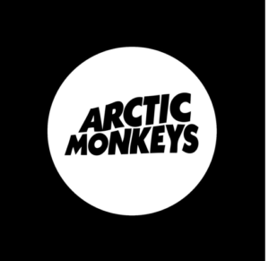
Wanna see how alignment play impacts design concepts? The Arctic Monkeys logo design explains it well with the way the letters are drawn, giving off a flag-like shape with a black-and-white typeface.
58. The XX
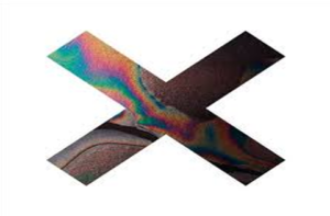
With their music being very enticing, their logo has the same feel. The X’s logo was designed by a student whose unique touch of oil imagery in the letter ‘X’ made the logo very famous.
59. Foo Fighters
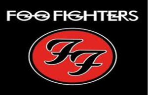
This one has several interesting details, from the four horizontal lightning bolts placed in the letters of the typeface to the bold color scheme, it all works together to capture Foo Fighters’s overall image.
60. Black Sabbath
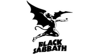
Ending on a high note, Black Sabbath’s rock logo features a winged figure which makes for a powerful addition to the rock band’s visual identity.
Rock Band Logos and the Graphic Design World
The music industry, especially the rock genre has been known to be a trendsetter for design in general. It’s widely known that music consumers associate the personality and lyrical genius of a band based on their rock group logos and album covers. We hope you took some graphic design inspiration from our rock band logo list and are all fueled up to design your own iconic rock and roll logo design concepts.
Are you ready to elevate your business with a professionally designed logo that stands out? Contact our expert logo design services today and transform your brand identity with creativity and precision.