Are you a design enthusiast? In this blog, we are going to dive into the world of fonts. A good typeface can play a vital role in any of your projects as font plays an important part. From sleek sans-serifs to elegant scripts, fonts play a notable role in setting the tone and conveying your brand’s message. This is why you must always be in the loop with the most popular fonts – it will keep your designs fresh and compelling.
In this guide, we look at the 35 most in-demand and reliable fonts for graphic designers to have under their belts by 2024. You will find all kinds of fonts: classic serif, modern sans-serif, playful script and attention-grabbing display type.
Whether you’re designing a logo, website or doing any other kind of graphics and typography work – these resources aim to inspire design in your typographic crafts. Without further ado, let’s dive in and take a look at some of the amazing fonts that are defining design this year!
What Are Most Common Fonts Used By Graphic Designers?
As a graphic designer, the fonts that you use will be crucial in creating one of a kind design. Most graphic designers use a selection of some classic or modern fonts that are interesting, versatile and offer flexibility as well. They became quite popular given their readability, versatility and use in communicating different feelings or styles.
Fonts that designers often use include:
1. Helvetica: A classic sans-serif font notable for its clean lines and neutral design.
2. Arial: A common sans-serif typeface, which is also often included as a web-safe variety of Helvetica.
3. Futura: A geometric sans-serif font that looks modern and simple.
4. Garamond: A classic serif font that is both elegant and very easy to read.
5. Roboto: A sans-serif font, characterized by the versatile application for digital interfaces.
6. Proxima Nova: A sans-serif font, which maintains a good balance between geometric and grotesque styles with the help of its modern vibe.
7. Montserrat: It is a modern-day sans-serif font which is inspired by urban typography.
8. Open Sans: A humanistic sans-serif font that provides readability in print, web, and mobile interfaces.
Such fonts are very common in graphic design because they can be used literally everywhere—from logos and branding to web design and print—due to the reason that they are versatile and fit well in different contexts. These fonts often make a good base while scrolling through the different typefaces for your design projects.
Sans Serif Fonts
Sans Serif Font Overview
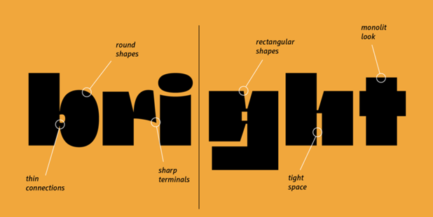
Sans serif fonts have become a popular choice for both students and professionals, especially as designing for screens and displays has gained prominence . These fonts are celebrated because of their neutrality and versatility in design, turning them into a really powerful tool in the hands of graphic designers. As the name implies, sans serif fonts lack small decorative strokes at the ends of letterforms—thereby having a minimalist look that can be really useful for a lot of designs.One of the key advantages of sans serif fonts is their clarity and readability. Their clean, straightforward lines ensure that each character stands out distinctly, making them invaluable in both print and digital media . This quality is particularly beneficial for students presenting research papers or creating academic posters, as it ensures their work is easily comprehensible.
Top Sans Serif Fonts
The following are a few sans-serif fonts that graphic designers are mostly considering using for their works:
1. Helvetica: The most neutral and universal font of all.
2. Arial: A font that is commonly used as a ‘web-safe’ alternative to Helvetica.
3. Futura: A geometric sans-serif font with a modern and minimalist feel.
4. Franklin Gothic: It is a simple, sleek and versatile font used in industrial design.
5. Roboto: Designed by Google for digital interfaces.
6. Proxima Nova: Balances well between geometric and grotesque styles.
7. Montserrat: Inspired by urban typography.
8. Open Sans: Designed for legibility across print, web, and mobile interfaces.
9. Avenir: A font designed after Futura and classified as a geometric sans.
10. Frutiger: It is a humanist sans-serif font that is meant to be easy to read from far away or when the text is small.
11. Univers: Univers’s low x-height and wide letter spacing make it look more spread than Helvetica, especially in bold.
12. News Gothic: The descenders are shallow and the letter shapes compact. Because of its relatively light weight and open letterforms, the typeface stands out from other grotesque sans-serifs and contributes to a less severe, humanist tone of voice.
13. Gotham: Gotham is a geometric sans-serif font with crisp, clean lines that is useful, easy to read, and has a simple style.
14. Gilroy: versatile sans serif font and can be used in a variety of contexts, from posters to websites.
Sans Serif Font Applications
Sans serif fonts are incredibly adaptable, making them suitable for a wide range of design projects. Whether you’re working on a website, brochure, resume, or presentation, these fonts seamlessly integrate into diverse design applications. This adaptability is basic for any professional approach in marketing, advertising, or graphic design.
In the digital world, sans-serif fonts are the font of choice for thousands of brands across the world because of their clarity, legibility, and simplicity. In fact, about 80% of designs for user interfaces rely on sans-serif fonts. They’re particularly effective for minimalist logos, as seen in Airbnb’s modern sans serif logo.
Sans serif fonts also work well where there’s very little room for copy. You’ll often see them used in signs, text in apps, and names on maps. They’re generally the way to go when building an app or designing a site, as legibility is a concern on screens that are small or have lower resolutions.
Serif Fonts
Serif Font Overview
Serif fonts have been a staple of typography for generations, noted for their classic appearance and distinguishing qualities. These typefaces are distinguished by short decorative lines or flourishes at the extremities of letter strokes, commonly known as “little feet” or “hooks”. Serif fonts provide a sense of heritage, class, and authority, making them a popular choice for a variety of design purposes.One of the primary benefits of serif typefaces is their good legibility, particularly in huge blocks of text. The flourishes draw your attention along the text, making it simpler to read longer information. This quality has made serif fonts a staple in books, magazines, and newspapers for ages.
Popular Serif Fonts
When it comes to the most common fonts used by graphic designers, several serif typefaces stand out:
15. Times New Roman: It is the most popular font and a classic choice for formal documents.
16. Georgia: Known for its excellent screen readability, hence best to use in business reports and writings like resumes.
17. Garamond: An elegant font with a rich history – favorite for books, manuals or any printed material that have large bodies of small type.
18. Baskerville: A transitional serif font with a touch of modernity.
19. Palatino: A versatile font which is widely used in publishing.
20. Didot: Perfect for luxury and high-end designs.
21. Bodoni: It’s a clean and simple font that looks exactly like a “Roman” one. It has hairline serifs and the typical contrast of thicker and thinner strokes.
22. New York: A serif font known for its classic appearance – perfect for many contexts: invitations, posters, book covers, advertisements, websites, logos, magazines, branding, photography etc.
23. ITC Lubalin Graph: ITC Lubalin Graph is a well-known font because it combines geometric forms with new ways of writing.
24. Gabriela Stencil: Latin and Cyrillic sans serif font with soft shapes and unique endings that look like curls.
25. Minion: Minion can be used in magazine and book design. Small caps, old-style figures, diacritics, as well as Greek, Armenian, and Cyrillic alphabets, optical sizes, condensed styles, and artistic alternates like swash capitals, make it very easy to read.
These fonts have stood the test of time and continue to be favored by designers for their versatility and aesthetic appeal.
Serif Font Use Cases
You’ll find serif fonts particularly useful in contexts that require a touch of formality and sophistication. They’re ideal for:
● Branding materials for established companies, law firms, and financial institutions.
● Print publications like books, magazines, and newspapers.
● Formal invitations and stationery.
● Luxury product packaging and advertising.
● Website headings and design elements that need a refined touch.
By incorporating serif fonts into your designs, you can convey a sense of trustworthiness, expertise, and professionalism to your audience. Remember, when using serif fonts in digital designs, pay attention to font size and line spacing to maintain optimal readability.
Script Fonts
Script Font Basics
Script fonts are designed to mimic cursive handwriting, adding a touch of calligraphy and a handwritten appearance to your designs . These fonts are divided into two main categories: formal and casual. Formal script fonts feature excessive curls and elongated embellishments, while casual script fonts are more fluid and less structured, suitable for casual design applications.
Best Script Fonts
When choosing script fonts for your projects, consider these popular options:
26. Halimun Script Style: A modern and fresh script that’s elegant, natural, and stylish.
27. Gistesy Signature Collection: Features natural movement for an elegant and chic vibe.
28. Peachy: A handwritten script with a wonderful and natural look.
29. Simple Thread Script: A calligraphy script with a thick and luxurious style.
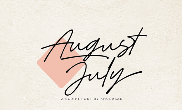
30. August July Script: A minimalist yet fancy-looking handwritten script.
When to Use Script Fonts
Script fonts are versatile and can be used in various design projects. They’re ideal for:
● Formal and elegant branding schemes
● Autograph logos
● Wedding invitations
● Social media graphics
● Book covers and greeting cards
You can use script fonts to add sophistication and flair to your designs. They pair well with other fonts, complementing and differentiating them effectively . However, be cautious when using script fonts in large blocks of text or small sizes, as they can be difficult to read . For best results, use script fonts in titles or short passages where their decorative nature can shin.
Modern Display Fonts
Display Font Characteristics
Modern display fonts are designed to grab attention and make a bold statement. These typefaces are characterized by their unique and stylized letterforms, often featuring exaggerated proportions and abstract shapes . Unlike traditional fonts, display fonts prioritize visual impact over readability, making them ideal for headlines, logos, and short bursts of text.
Trending Display Fonts
In 2024, we’re seeing a surge in experimental and dynamic display fonts. Designers are pushing boundaries with variable fonts, allowing for more flexibility and creativity in typography. Some trending display fonts include:
31. Neue Montreal: A versatile grotesque with 14 weights (7 Uprights, 7 Italics) and a slightly tighter kerning.
32. F37 Sonic: A sharp, geometric sans serif with distinctive circular geometry.
33. Canela: A unique typeface that blends sans and serif characteristics.
34. GT Super: Inspired by 1970s and 80s display serifs, available in 20 styles.
35. Migra: A font with spiky serifs inspired by migratory birds.
Display Font Design Tips
When working with display fonts, consider these tips:
● Use sparingly: Reserve display fonts for headlines or short text to maintain readability.
● Create contrast: Pair display fonts with simpler typefaces for balance.
● Consider context: Choose fonts that align with your brand personality and audience needs.
● Experiment with size: Play with font sizes to create visual hierarchy and interest.
● Mind the details: Pay attention to kerning and spacing to ensure optimal legibility.
Remember, the key to effective use of display fonts is striking a balance between expressivity and functionality. As the trend evolves, we’re seeing a shift towards more balanced expressive typography that prioritizes both user needs and brand personality.
Conclusion
The world of typography is always changing, giving designers more and more fonts to use to make their ideas come to life. There are clean lines in sans serif fonts, beautiful flourishes in serif fonts, and passionate writing in script and display fonts. Each typeface has its own style and purpose.As we’ve looked at the most popular fonts of 2024, it’s clear that adaptability and readability are very important when choosing a font. Designers have to find a balance between how something looks and how it works. So now, when you start your next design job, keep in mind that the right font can make all the difference.
Currently looking to improve your business with a professionally made logo, you might want to check out Expert Logo Designs for help. If you know the subtleties of different font styles and keep up with type trends, you’ll be able to make smart choices that make your designs better and connect with your audience.
FAQs
What is the most popular font style for 2024?
In 2024, the trend is towards unique sans serif typefaces. Designers choose geometric sans serif fonts with specific qualities such as uneven lines, elongated and expressive limbs, and strange shapes in letter openings, giving them a distinctive and unconventional appearance.
Which fonts are essential for graphic designers?
Graphic designers should consider having these essential fonts in their toolkit:
● Futura
● Didot
● Gotham
● Bodoni
● Univers
● Gilroy
● Rockwell
● Helvetica Neue
What is a notable typography trend in 2024?
A significant trend in typography for 2024 is Kinetic Typography. This style involves integrating motion and animation with text, which allows designers to add depth, personality, and context to textual content. This dynamic approach enhances user engagement and enriches the overall experience with digital media.