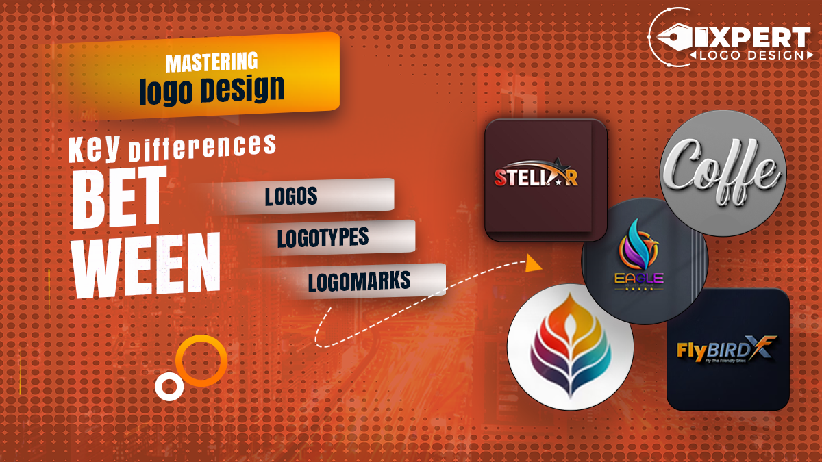

In the world of branding, a logo is much more than just a visual mark; it’s a translation of a brand into an iconic graphical representation. Whether you are an experienced logo designer or a business owner launching a new brand, the subtleties between what a logo, logotype, and logomark exactly are will be important to understand. The terms are all commonly used interchangeably, although all three have different meanings and roles within the design process.
What is a Logo?
At its core, a logo is a symbol or design used to represent a brand. It’s the visual cornerstone of your brand identity, communicating vitally important values, mission, and personality for your company in one swift glance. Logos may take many shapes, from simple icons to the most elaborate designs, but generally, they fall into one of the three main categories: logotypes, logomarks, and combination marks. Each of them serves a different purpose and hence carries unique characteristics that make it suitable for certain branding needs.
Logotype: The Power of Typography
What is a Logotype?
A logotype, or wordmark, is a type of logo that depicts a brand name through stylized typography. Unlike a logomark that would involve symbols or images, a logotype relies on text alone to carry the meaning across for the brand. Some of the classic examples are the famous brands where the name itself becomes the visual focus, such as Coca-Cola, Google, and IBM.
Logotype Meaning and Definition
The word “logotype” derived from the Greek word “logos,” which means “word,” and “typos,” meaning “imprint.” Quite literally, a logotype is a written version of the name of a brand that also doubles as its logo. The typography has to be painstakingly chosen and crafted to personify the voice and values of the brand in order for the text to become not only readable but pleasing to the eyes.
Logotype Examples
Think of the Google logotype, for example-something as simple as a logotype creation and yet powerful; it uses customized typography to make a brand memorable. Another well-known example is Coca-Cola. The Coca-Cola logotype is an elegant, flowing script that has become synonymous with the brand and recognized instantly, no matter where you go in the world.
Why Choose a Logotype?
A logotype is ideal for brands having unique and memorable names. It ensures that the brand name is always at the front and center where it would most easily remembered by customers. Besides, it functions great across a wide array of media and sizes-from billboards down to business cards.
Logomark: The Symbolic Identity
What is a Logomark?
A logomark, also called a “logo mark” or “brand mark,” is a logo that consists only of a symbol or icon and no text. Logomarks are really effective for brands that want to create a strong identity visually that could work well on its own without the company name. Eventually, this comes to be the visual shorthand for the brand that is recognizable without words.
Logomark Meaning
A logomark is a symbolic representation that stylizes an organization and houses its essence within an abstract and simple design. For example, Apple’s logomark; an apple with a bite taken out of it is recognizable without words accompanying the image globally.
Logomark Examples
The Nike swoosh is arguably one of the most recognizable logomarks in the world; simple and dynamic, while exuding the brand’s focus on movement and athleticism. Then there is the well-recognized Apple logo, which has come to equated with innovation and quality.
When to Use a Logomark?
For a brand who already has plenty of recognition, or for anyone who wants to have a logo that is versatile enough for any use case, the logomark fits the bill. It works very well in digital; that is where simplicity and scalability prevail.
Logotype vs. Logomark: Which is Right for Your Brand?
Factors such as your brand name, your industry, and your overall marketing strategy determine whether you need to choose a logotype over a logomark.
Brand Recognition: A logotype will be the best option if you want to make a unique and well-noticeable brand name. If you’re trying to make an abstract, versatile symbol that could used independently of your brand, a logomark could serve best.
Versatility: Logomarks are generally more versatile than logotypes since they can reduced to extreme small sizes and still remain recognizable. They, therefore, easily suit apps, social media, among other digital uses.
Brand Personality: Consider what personality you would like to communicate. A logotype has been quite direct, professional, while a logomark can get creative and abstract.
The Hybrid Approach: Combination Marks
For most brands, however, the best solution is some sort of combination of both: a logomark and a logotype. This is a good way since it allows the use of them with and without each other where the context demands it. Think of Pepsi or Adidas, both with a combination of text and iconography that can separated or combined without losing brand recognition.
Typography in Logotypes: Making Your Brand Stand Out
The typography used in a logotype is of the highest importance. It’s not just a case of selecting any old font, but a typeface that reveals your brand’s personality. Typography logotype design requires true understanding of how various typefaces convey different messages. A sans-serif font, for example, can suggest something modern and clean, whereas serif fonts are traditional and trustworthy.
If you’re looking for the perfect typeface to make your brand stand out, check out our blog on The 35 Most Popular Fonts for Graphic Designers in 2024 for some inspiration.
Logotypes and Logomarks: Their Evolution
Logos have trended significantly over the years, moving from designs that are elaborate to minimalist. Today, many brands are moving toward logotypes and logomarks that are simpler and cleaner. These are easier to reproduce on a variety of platforms.
To take a deeper dive into the latest in logo design, read our blog on what’s Popular in Logo Design Right Now.
Why You Should Understand the Difference
It’s crucial to know the difference between a logotype and a logomark; this enables one to make conscious design decisions when picking the right form for their logo, which should aligned with the brand’s ambitions and consistency across all branding material.
Case Studies: Successful Use of Logotypes and Logomarks
The Logotype of Google: The stake of Google on a simple-colored logotype upholds brand recognition and it can altered to even playful logo variations, such as Google Doodles.
Apple Logomark: The fact that Apple elects to have a logomark enables a sleek and very modern look, but is instantly distinguishable without the company name attached.
Nike’s Combination Mark: It has given Nike the flexibility of using the text and the swoosh symbol either together or separately depending upon the context in which it used.
Conclusion: Choosing the Right Logo for Your Brand
Ultimately, whether your brand needs a logotype, logomark, or combination mark left to its specific needs and identity. Knowing the distinguishing characteristics between a logotype, logomark, and combination mark will allow you to make the smartest choice on behalf of your brand.
If you need to create a logo that actually represents your brand, Expert Logo design must be your go to solution. Our professional designers specialized in creating custom logos capturing the essence of your brand-be it a logotype, logomark, or even a combination mark. Contact us today and start your logo design journey today!