A logo is not just pasting images and text together but rather an expression of a visual identity communicating the intrinsic feel of a brand. Research shows that it takes only 0.05 seconds for users to form an opinion about your website, and a significant part of that impression is influenced by your logo and branding.
Logos for dance companies, teams, or classes can be very important because they are representations of movement, rhythm, and artistry. Whether you’re opening a new dance studio, setting up a hip-hop crew, or hosting a dance competition, your logo is that very first image that speaks to your audience.
This all-encompassing guide dives into the intricacies of dance logo design with insights, inspiration, and practical advice on how to create a standout logo.
The Importance of a Dance Logo
A dance logo is more of a strategic asset than an aesthetic choice. It captures the spirit of dance, mirrors the energy of the performer, and sets the nature of your brand. A well-designed dance logo promotes:
● Brand Identity: Your logo develops an identity for your Dance Company or your team, making it outstanding and different from others, thereby creating a lasting impression.
● Attract Clients and Students: An attractive dance logo should allure potential clients, students, and collaborators by projecting professionalism and creativity.
● Memorability: A memorable logo will help your audience recognize and remember your brand. It is in this way that this aspect becomes very important in a crowded and noisy market.
Key Features of a Successful Dance Logo
Before getting into some dance logo ideas, let’s run through the key elements that make for an effective logo. These are:
● Simplicity: A simple logo is memorable and versatile. It is easy to be used on any platform, from business cards to billboards.
● Relevance: There should be some relevance to the nature of your dance company or team in the logo. For example, a hip hop dance logo will incorporate elements reflecting the setting of an urban environment, and the logo of a ballet studio will reflect poise and class.
● Versatility: It should look good in various contexts: on a website, on social media, on merchandise, or on promotional material. It has to look good both in color format and black-and-white.
● Timelessness: Try to come up with a design that remains relevant in the long run, avoiding too trendy elements that may become outdated quickly.
● Memorability: A unique and creative dance logo will impress the audience easily and build brand loyalty.
Exploring Different Kinds of Dance Logos
There are so many logotypes to decide on in designing a logo for a dance company, each with its own strengths:
● Wordmark Logos: A wordmark logo is one in which a dance company or a team’s name is used as the prime design element. Of course, the major action happens in the typography, which is then stylized to reflect movement and energy.
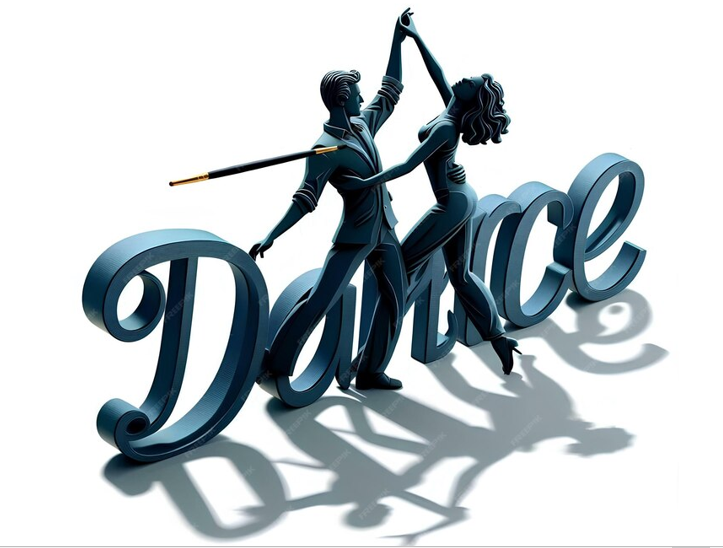
● Pictorial Logos: A pictorial logo is the one in which a symbol or an icon replaces a brand name. This may be a silhouette of the dancer, something relating to dancing, or even some abstract design that evokes movement for a dance logo.
● Combination Logos: This consists of a text and a symbol. It is flexible and can be used in different arrangements on different media.
● Abstract Logos: Abstract logos are those which avoid any likeness to reality and provide only a non-literal design based on geometric shapes. Such logos can become very creative, but must be designed with extreme care to still retain something of the dance brand’s feel and identity.
Dance Logo Design Ideas and Inspiration
When brainstorming dance logo ideas, consider the following approaches:
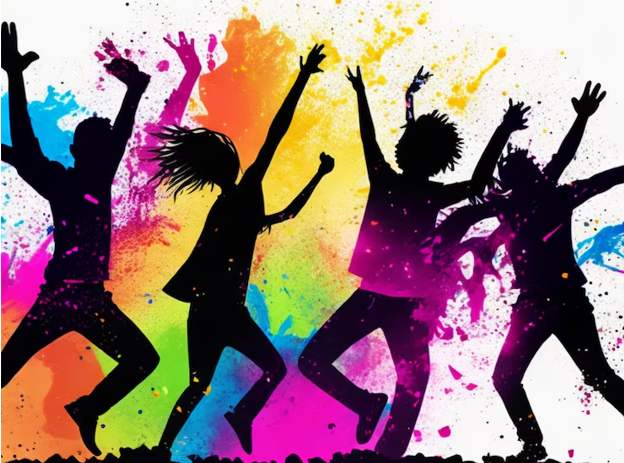
1. Incorporate Movement: Dance is all about movement, so your logo should reflect that dynamic energy. Consider using flowing lines, swirls, or abstract shapes that suggest motion.
2. Work with Dance Poses: Dancer silhouettes in various dance poses go a long way in conveying this art form. Whether it is a ballerina en pointe, a hip hop dancer, or even a couple embracing in the Tango, dance poses are sure to instantly communicate your brand’s focus.
3. Typography at Play: Typography happens to be the most powerful logo design tool. Try a font that conveys the mood: sophisticated serif fonts for ballet, bold and modern fonts for hip hop, or playful, quirky fonts for kids’ dance classes.
4. Color Choices: Colors are subjective and depict emotions. They form the brand identity that goes on to carve its niche. For example, any colorful dance logo will connote liveliness, energy, or any other similar meaning; a black dance logo will draw out the impression of sophistication, elegance, etc. Keep in mind your brand’s personality when picking out the colors.
5. Symbolism: Use form-relevant symbols. Logos for ballet could incorporate ballet shoes, tutus, or even feathers; those for hip hop could incorporate graffiti or cityscape elements.
6. Minimalism: Sometimes less is more. A minimalist logo with clean lines and plain design works in a big way, especially when you need your brand to come across modern and professional.
Designing a Dance Logo: Step-by-Step Guide
Designing a dance logo requires an equally strategic and creative process with a deep insight into your brand. Here’s an elaborate step-by-step guide on how you can create a logo that fully represents your dance brand.
1. Research and Gather Inspiration
Before diving into the design process, take the time to research your market and gather inspiration:
● Analyze Competitors: Look at the logos of other dance companies, studios, and teams in your niche. What works well? What doesn’t? Identifying gaps in the market can help you create a logo that stands out.
● Explore Different Styles: Explore a variety of dance logo images and dance logo pictures online. Create a mood board with examples that resonate with your brand. Pay attention to different styles, color schemes, and typography.
● Know Your Audience: Think through who your audience is—are they children, teens, adults, or professionals? Your logo should appeal to them and reflect the kind of dance experience you offer.
2. Define Your Brand Identity
Your logo should be a visual representation of your brand’s identity. Before you start designing, define the following:
● Mission and Values: What does your dance brand stand for? Are you focused on classical training, contemporary innovation, or community engagement?
● Brand Personality: What is the personality of your brand? Is it fun and playful, or sophisticated and refined? Your logo should speak to this personality.
● Unique Selling Proposition (USP): What sets your dance brand apart? Is it some form of dance, in particular, that you specialize in, or is it the kind of inclusivity or just the world-class instructors? Your USP should be what influences your logo design.
3. Idea Generation/Brainstorming and Sketching
Brainstorm and sketch out some ideas to kick-start the creative process:
● Visual Metaphors: Visual metaphors can use symbols like flowing ribbons, musical notes, or other abstract shapes that denote movement and, thereby, relate to dance.
● Dance Poses and Silhouettes: Different dance poses or silhouettes which will become the focal point of your logo can be sketched. They will denote style and specialty in dance.
● Experiment with Typography: Try different fonts that reflect your brand’s personality. Consider ways in which the typography could create a sense of movement and rhythm.
4. Choose the Right Typography
One of the most prominent elements for your logo has to be typography.
● Font style: The font style has to be in line with whatever kind of mood you want your brand to purvey. For example, a ballet studio could use serif for elegance or a hip-hop dance team who would rather use bold sans-serif for modernity.
● Customization: Playing a little with the font curvature or some unusual element could make your logo even more unique. For instance, extending the tail of a letter to match the flow of a dancer’s motion can be very creative.
● Legibility: Make sure the font you choose is clear and readable in various sizes. Your logo should be clear and as legible on a small business card as on a big banner.
5. Select a Color Palette
Color has a huge influence on how your customers are going to view your brand.
● Color Psychology: Colors can arouse a lot of emotions. For instance, red can be a color that states passion, energy, etc. However, blue would show a lot of trust and professionalism. So think about what kind of feelings you want to associate your brand with, and use colors accordingly.
● Brand consistency: Consider colors consistent with other brand elements, like websites, staff uniforms, and other marketing materials. This reinforces the brand.
● Contrast and Versatility: Be sure to have versions of your logo in full color and in monochrome. While a colorful dance logo can be full of vigor and become an eye-catcher, a black dance logo is just as effective when the situation calls for something simple and formal.
6. Designing the logo
Armed with your research, thumbnail sketches, and color palette in hand, it’s time to design:
● Design software: Professional design software like Adobe Illustrator or CorelDRAW will have everything needed to create a polished logo. If you are not a professional designer, then you can utilize web-based logo design tools or hire a professional designer.
● Balance and composition: Ensure that your logo is well-balanced and composed to ensure that everything in relation is proportionate and focuses on harmony. The proportions have to be natural and pleasing for the eyes.
● Scalability: Your logo needs to be scalable. What this means is that it should look equally good on a big banner or a small social media icon. It is ideal to use vectors for keeping the logo sharp, whether big or small.
7. Gather Feedback and Refine
Testing is paramount before finalizing your logo:
● Share with Stakeholders: Share logo designs with the main stakeholders, be it the members of your team, students, or other colleagues’ you have trust in. Their insight may shed light on some things that were not considered.
● Surveys or Focus Groups: If possible, test a logo concept by conducting a small survey or focus group with part of your target audience.
● Iterate and Refine: Use feedback to make any adjustments that might be required. Whether it is a tweak in color, type adjustment, or simplification of design—whatever may be—it is a very important step in the design process.
8. Finalize and Test Your Logo
Once you have refined your design, the finalization of your logo is just a step ahead:
● Test across Platforms: The logo should look great on all platforms, from a website to social media profiles, printed matter, and merchandise. Try it out in various color schemes, and sizes.
● Brand Guide: Document the proper use of your logo; outline what color codes and typography specs one needs to adhere to, along with information on spacing. It ensures that all of your branding efforts go smoothly.
● File Formats: Save your logo in numerous file formats that can be applied where necessary. Vector files, such as .AI or .EPS, are used for printing, while raster files are used for digital purposes, like .PNG or .JPEG.
Top 10 Dance Logos for Your Inspiration
To inspire your creativity, here are ten outstanding dance logos representing impeccable design.
1. Alvin Ailey American Dance Theater
The Alvin Ailey logo is an example of motion typography. The stretched, elongated letters evoke a sense of dancers moving, thereby truly capturing the dynamism of the company’s performances.
2. Joffrey Ballet
The Joffrey Ballet wordmark logo is clean and lean, designed using a sans-serif font, which imparts very modernistic lines, It reflects the modern focus of the company on contemporary ballet with classic appeal.
3. Hip Hop International
This logotype uses bold typography with an urban flair that clearly identifies with the street culture roots of hip hop dance. Angular lines and design elements bring out the raw, energetic feeling of hip hop, thus suited perfectly for a brand that corresponds to global hip-hop dance competitions.
4. Martha Graham Dance Company
The logo of the Martha Graham Dance Company is a stylized figure that flows and glides like modern dance. It is so creative and impressive how the dancer’s shape is made out of negative space into a logo as artistic as the performances which it represents.
5. Royal Academy of Dance
The Royal Academy of Dance’s logo is based on some traditional elements reimagined in a somewhat modern way. At the same time, the crest-like design nods towards its prestigious history, and the ultra-modern font keeps the logo alive for modern times.
6. Cirque du Soleil
Although Cirque du Soleil is not, in the strict sense, a dance company, its logo is certainly creative and quite a visual stunner. The sunburst design is playful and fanciful, suggesting the spirit of the performance: dancing, acrobatics, and theater combined.
7. Dance Theatre of Harlem
Balanced against the silhouette of a dancer in a classical arabesque pose, the Dance Theatre of Harlem logo is set in a very modern, bold font. This contrast of strong typography and a graceful figure shows the duality of the company’s performance: powerful and elegant.
8. Dance Moms
The logo of the popular TV series “Dance Moms” is playful and striking. It incorporates a vivid pink color palette with bold, quirky typography that hints toward what the show is about: competitive dance for young dancers.
9. Bolshoi Ballet
The Bolshoi Ballet logo is steeped in tradition, featuring a classic serif font that expresses elegance and authority. Within the color scheme, gold and red enhance the sense of greatness associated with being one of the oldest, most respected ballet companies in the world.
10. So You Think You Can Dance
The “So You Think You Can Dance” logo is very dynamic, on the move, in a modern font, very much expressive of the nature of a high-energy show. Brought into bright, bold colors, with its angled lines, this is a very good way to express energy and competition within the show to captivate it in memory.
Conclusion: Give Wings to Your Brand with a Professional Dance Logo
Designing a dance logo is an art. It requires in-depth knowledge of your brand, your audience, and the tenets of design. A well-designed logo could make your dance brand more memorable, attractive, and trustworthy.
If you’re ready to create a logo that really speaks for your dance company, class, or team, it’s time to work with professional logo design services. At Expert Logo Design, we are experts in creating custom logos speaking volumes about the image that flows into the heart of people and represents something unique in your brand. Our expert team of designers will work with you to bring your vision into reality, ensuring that not only is your logo an aesthetic masterpiece but a helpful tool for your branding strategy.
Make that first step to a high-strutting brand identity. Let us help you get going with your perfect dance logo.