Diving into the world of iconic brands, you’ve surely encountered the universal symbol of fashion and aspiration for kids around the globe – the Barbie logo. Spanning generations, this recognizable emblem not only transcends toy aisles but has also made significant imprints in various forms of media, including Barbie movies.
Its evolution speaks volumes about societal changes, reflecting shifts in fashion, careers, and inclusivity standards. Understanding its history offers a fascinating glimpse into how a brand can influence, and be influenced by, cultural narratives, making it a topic of relevance and interest for anyone curious about the power of branding.
By the end of this exploration, you’ll gain a deeper appreciation for how this iconic symbol has navigated the complex landscape of societal values and emerged as a beacon of progress and nostalgia.
The Origin of the Barbie Logo
The inception of the Barbie logo marked a significant milestone in branding for toys, specifically aimed at inspiring young girls. When you delve into the early stages of this iconic symbol, you’ll discover that the initial design concepts were heavily influenced by the prevailing trends of the 1950s. The logo’s design was crafted to resonate with a sense of style and aspiration, mirroring the elegant and chic fashion of that era.
Initial Design Concepts
The original Barbie logo was conceptualized to project an image of sophistication and accessibility. Its cursive script was not only stylish but also aimed to convey a personal touch, as if Barbie herself had signed each product. This approach helped establish a direct emotional connection with the audience, making it more than just a brand; it became a relatable character for young girls.
Early Marketing Strategies
In terms of marketing, the strategies employed during the early days were groundbreaking. The logo was strategically placed in all advertisements, packaging, and promotional materials, ensuring high visibility and brand recognition. Early campaigns were focused on print media and television, where the logo often appeared alongside the doll, creating a visual association that reinforced the brand identity. These efforts were pivotal in embedding the Barbie logo in the minds of a generation, setting the stage for its enduring legacy.
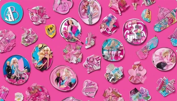
A Pinktastic Evolution of the Barbie Logo Over the Years
The Birth of an Icon (1959 – 1975): The Swinging Sixties Signature
When Barbie first strutted onto the scene in 1959, she brought with her a logo that was as stylish as the doll itself. Picture this: a delicate, handwritten script in a soft pink hue that practically whispered “glamor.” This original logo was like Barbie’s first autograph, capturing the essence of the era’s feminine mystique.
Fun fact: The creator of Barbie, Ruth Handler, named the doll after her daughter Barbara, and this first logo had all the personal touch of a mother’s love!
The Groovy Makeover (1975 – 1991): Disco Fever Hits the Logo
As bell-bottoms and disco balls took over, Barbie decided it was time for a change. The logo ditched its dainty script for a bold, no-nonsense typeface that screamed “modern woman.” This wasn’t just a font change; it was a statement. Barbie was ready to break free from traditional roles, just like the women of the era. Interestingly, this period saw the introduction of Barbie’s career lines, including the groundbreaking Astronaut Barbie in 1985. The logo’s strength mirrored Barbie’s expanding horizons!
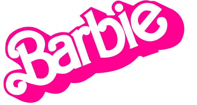
The Radical Redesign (1991 – 1999): Totally Awesome 90s Vibes
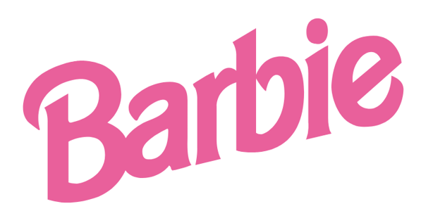
The 90s hit like a neon tsunami, and Barbie rode the wave with gusto. The logo went full-on edgy, with a slanted, almost graffiti-like font that could have been spray-painted on a wall. This wasn’t your mother’s Barbie anymore! This era coincided with the launch of the “Generation Girl” line, which introduced more diverse dolls and reflected the logo’s bold new attitude. It was during this time that Barbie also got her first belly button – talk about body positivity!
The Millennium Nostalgia (1999 – 2004): Y2K Meets Retro Chic
As the world worried about the Y2K bug, Barbie decided to party like it was 1959! The logo took a nostalgic turn, bringing back elements of the original script but with a modern twist. It was angled like a signature, as if Barbie herself had just autographed it. This clever blend of old and new reflected the turn-of-the-millennium trend of remixing retro styles. During this period, Barbie also launched her first official website, proving she could rock both the digital and analog worlds!
The Blossom Era (2004 – 2005): Flower Power Reloaded
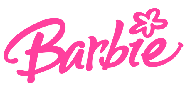
For a brief but memorable moment, Barbie’s logo bloomed with creativity. The iconic bright pink took center stage, accompanied by a playful flower dotting the ‘i’. This whimsical touch was a nod to the resurgence of 60s and 70s styles in fashion. Although short-lived, this logo coincided with the launch of the “My Scene” dolls, Barbie’s answer to the growing popularity of Bratz dolls. The flower power may have been fleeting, but it certainly left its mark!
The Minimalist Revolution (2005 – 2009): Less is More, Darling
As the world embraced sleek smartphones and clean design, Barbie followed suit. The logo stripped down to its essentials, featuring a bold, no-frills font that meant business. This minimalist approach aligned with Barbie’s expanding role as a cultural icon beyond just a doll. During this time, Barbie broke into the vlogging world with her own YouTube channel. Who says you can’t be an influencer and a classic at the same time?
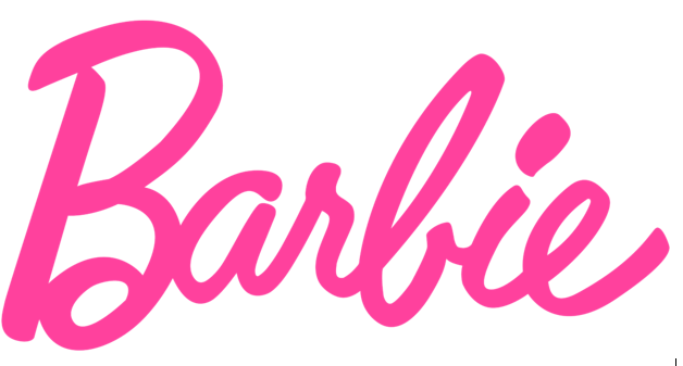
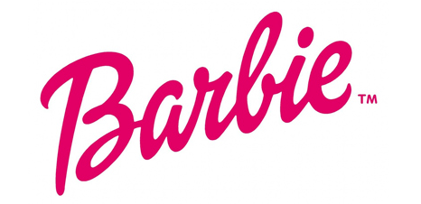
The Classic Comeback (2009 – Present): Vintage Vibes for the Win
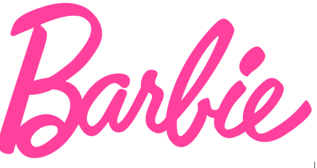
In a world of constant change, Barbie decided to embrace her roots. The current logo is a loving tribute to where it all began, featuring the classic script font and that oh-so-familiar soft pink. But don’t be fooled by its retro appearance – this logo represents a thoroughly modern Barbie. Since 2009, we’ve seen Barbie break boundaries with diverse body types, skin tones, and even a line of gender-neutral dolls. The classic logo now stands for inclusivity and empowerment, proving that true icons can evolve while staying true to their essence. If you’re one of those looking to create timeless and impactful logos for your brand, you must consider Expert Logo Design services, where creativity meets precision in crafting memorable brand symbols.
Changes in Typeface
Originally, the Barbie logo featured a cursive, elegant typeface that resonated with the 1950s’ style and sophistication. However, as the decades passed, the typeface underwent subtle yet impactful modifications. In the 1970s and 1980s, the logo adopted a more bold and rounded typeface, mirroring the era’s fashion for bolder and more assertive styles. This shift not only marked a change in aesthetic preferences but also aligned with the empowerment movements prevalent at the time, suggesting Barbie’s alignment with contemporary values.
Color Variations
The iconic pink color of the Barbie logo has remained a constant, but the shades and intensity have seen variation. Initially, a soft pastel pink dominated the logo, embodying femininity and charm. Over the years, the pink deepened and sometimes incorporated vibrant, energetic hues, especially in the late 1990s and early 2000s, to appeal to a younger, more dynamic audience. These changes in color not only kept the logo fresh but also helped maintain its relevance in a rapidly changing cultural landscape.
Logo Modifications
Logo modifications over the years have included alterations to its graphical elements to keep it modern and appealing. For instance, the addition of stars and swirls in some versions of the logo during the 2000s introduced a playful, whimsical element, targeting a younger demographic. Each modification was thoughtfully implemented to ensure that while the logo stayed current, it still retained elements of its original charm and recognition.
Cultural Impact and Legacy
Exploring the cultural impact and legacy of the Barbie logo reveals its profound influence on fashion and pop culture, resonating far beyond the toy aisles.
Influence on Fashion
The Barbie logo has been a significant trendsetter in the fashion industry. It’s not just about the pink color; it’s about the style and identity that the logo represents. Designers have often drawn inspiration from Barbie’s iconic branding, incorporating its elements into various fashion lines that emphasize empowerment and playful elegance. This influence extends to major fashion shows where models strut in Barbie-inspired outfits, highlighting the logo’s lasting impact on fashion esthetics and industry trends.
Impact on Pop Culture
Barbie’s influence on pop culture is unmistakable. The logo has appeared in various forms of media, from TV shows to blockbuster movies, symbolizing more than just a brand — it represents a lifestyle. Its presence in pop culture has sparked discussions around gender roles and societal expectations, making Barbie a focal point in conversations about feminism and identity. The logo itself has become a symbol of change, often adapted to reflect contemporary issues and to promote messages of inclusivity and diversity.
Modern Interpretations
In the 21st century, the Barbie logo has undergone several redesigns to stay relevant and appealing to contemporary audiences. These updates have not only refreshed its visual identity but have also aligned it with current cultural and social norms.
21st Century Redesigns
You’ll notice that recent iterations of the Barbie logo have adopted a cleaner, more modern esthetic. The use of sleek, sans-serif fonts and streamlined graphics reflects a shift towards minimalism in design trends. This modernization helps the logo stand out in digital media, where clarity and simplicity are paramount. Additionally, these redesigns often incorporate a brighter, more vibrant shade of pink, injecting a youthful and energetic vibe that appeals to today’s young consumers.
Collaborations and Special Editions
Barbie’s collaborations with various artists and brands have led to special edition logos that capture the essence of these partnerships. For instance, collaborations with fashion designers have seen the Barbie logo infused with unique stylistic elements that reflect the designer’s signature style. These limited-edition logos not only serve as a marketing tool but also as a collector’s item, enhancing the brand’s appeal to a broader audience, including adults who appreciate the nostalgic value of Barbie.
Conclusion
Through this journey into the evolution of the Barbie logo, we’ve observed how its transformations over the decades mirror societal shifts and consumer preferences. From its origins embodying 1950s elegance to its modern interpretations that embrace inclusivity and diversity, the logo has consistently stood as a beacon of progress.
Each iteration tells a story, not just of a doll, but of the generations of children (and adults!) who have grown up with Barbie. As we look at the logo today, we’re reminded that while styles may change, true icons are timeless. Here’s to Barbie – may she continue to inspire and surprise us for generations to come!