As in the world of branding, everything revolves around the image, designed to hold us, entice us, beguile us and most often try to sell us something – a logo is the ultimate tool that raises the curtain. It creates an average customer’s first impression and sets the stage for the company’s identity.
The urge to make memorable logos for businesses has seen some of the elements, including the red crown, which has become very popular because of its bold statement and powerful symbolism. Whether you are a logo designer, a new brand owner, or a startup, creating the logo with a red crown can a strategic choice to get the most impact and instant recognition at the same time.
This extensive guide will take you through why a red crown could be great for the prestige of the brand, how to design one for maximum effect, and the practical steps towards an aesthetically beautiful logo. We shall also add useful statistics and talk about current trends by linking to our other insightful articles for a holistic understanding of logo design.
What’s with The Red Crown? Its Branding Significance
Crown in red shade is an attention grabbing piece which symbolizes power, vitality and affluence. Such crowns embraced by people in many occupations ranging from high end clothing designers to tech geeks. But what is it about a crown and the color red that draws people so much?
● Symbolism of the Crown:
It is not unusual that a crown is a powerful symbol of kingship, command, and superiority. Preferring such imagery for a brand brings a sense of elegance and respect, thus enhancing its sense of prestige. In today’s world, such perceptions can the deciding factors in achieving differentiation.
● Psychological Effects of Red:
Red is the color known for inciting the highest level of emotions. It connected to esteem, desire, and urgency to the extent that commands attention and causes an action. Studies on the psychology of colors assert that red is 42% more discernible when it is incorporated into a logo than any other color. In other words, the effect of this color cannot be overemphasized for brands that wish to be seen within the shortest time possible
● Combination’s Effect:
An image artfully painted with a red crown gives a sense of belonging to a bold energetic authority which is what appeals to the audiences in their search for assuredness and trust within a brand.
Due to the effective allure of using red with a crown, many companies tend towards red crown logos. For example, most fast-food restaurants incorporate red in their logos to help arouse hunger and focus attention, or luxury items that come with crowns to enhance their position in the market. Similarly, for newer brands, this combination could be fundamental, embellishing faithfulness amongst the clients.
Step-By-Step Guide to Designing a Strong Red Crown Logo
A red crown logo should be designed in such a way that it does not overwhelm the viewer but still creates an impact. Here’s a step-by-step guide on how to design a strong, balanced logo that catches the eye.
1. Define Your Brand’s Core Identity
Before you begin with any design, define your brand’s values and target audience. Ask yourself these questions:
● What will the message of the brand be? If authority and innovativeness, a slightly more up-to-date stream-lined shape for the crown might get the job. For heritage and tradition purposes, one may need more ornate crown designs.
● Who are the brand’s target customers? Knowing exactly what would appeal to their tastes would help you make the decision to create more detailing in the crowns with regard to red tint or other icons.
By identifying these aspects, you’ll be in a position to design a logo that is visually appealing and goes a long way in connecting with your target audience.
2. Choose appropriate Red Tint
The color red does not simply mean red. The tone of red that you choose will affect how your logo would generally be perceived and also the overall feel it would have.
● Bright Red: Lively, dynamic and full of motion, appropriate for modern and active brands.
● Dark Red: Embodies sophistication, deep love and status, many high-class goods’ manufacturers prefer using this color.
Make use of tools like Adobe Color or Coolors to play with different shades of red and see the effects of different shades on other design elements.

3. Choose the Right Crown Style
Crowns can be done in the most minimalist of contours or be the most elaborate in their designs, even sometimes in jewel-encrusted designs. Some options are:
● Traditional Crown: Suitable for brands that want to convey tradition and the timelessness of the brand.
● Modern Crown: A crown that seems modern, more styled and minimalist, and suitable with the theme of modern and innovative brands.
● Abstract Crown: Uses crown shapes symbolically without direct detailing, ideal for brands that want a hint of luxury without being literal.
Designers can explore these options to find a crown style that complements the brand’s character, further enhancing its identity.
4. Avoid Excessive Use of Supporting Elements
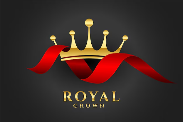
A plain red crown can do the job on its own, but embellishing it with a few cute extras, like ribbons and jewels or even with some geometric lines will enhance the beauty of the logo. Do remember that it is always better to keep the logos to the bare minimum—don’t overcrowd the logo or else the impact will be lessened.
For instance, a tiny flare can be used to emphasize the shine of the crown or rather a geometric base can provide stability to the crown in a more techy oriented design. Employ such extras judiciously to keep the overall appearance effective and uncluttered.

5. Include Contemporary Developments
The trends of the current times will help in designing a logo that is not outdated. Most of the brands nowadays put elements of 3D spinning in their logos so that they can different from others. To learn how to do such dynamic elements, Read our detailed guide on how to design 3D spinning logos.
6. Cross Test
Cross testing the logo on different materials, backgrounds, and screen sizes will help you ensure that the logo looks good and also remains uniform. A good logo should be able to maintain its sharpness irrespective of the media used whether is a website, a business card or a billboard.
Also think about the impact of motion design as many companies have opted to invest in animated 3D logotypes instead of static graphics. Check out the amazing 3D logo animation software and learn how to use them efficiently.
Statistics: Why a Red Crown Logo Works for Brands
To highlight the effectiveness of a red crown logo, let’s look at some compelling statistics:
● Color Recognition: Research shows that 80% of brand recognition comes from color alone, emphasizing the significance of choosing the right color palette. Red, in particular, increases attention and stimulates action, making it ideal for brands that need to stand out in a saturated market.
● Visual Symbols’ Impact: A study by MIT showed that logos with recognizable symbols, such as crowns or shields, had a 25% higher recall rate among consumers, proving that symbolic logos can foster stronger brand recognition and retention.
These insights affirm the value of color and symbolism in logo design, underscoring why a red crown logo can especially effective for startups and new brands looking to establish a strong, memorable presence.

Which Brands Can Use Red Crown Logos?
Studying successful brands that use the red crown in their logos can provide valuable inspiration:
● Luxury & Fashion Brands: Many high-end fashion brands incorporate crowns to communicate prestige. Their red crowns signal exclusivity and high status.
● Tech Companies: In the tech industry, red crowns used to signify strength and forward-thinking. integrating a crown into their logos, these companies aim to differentiate themselves in a highly competitive sector.
● Sports Teams and Organizations: Crowns in sports logos often symbols of victory and dominance, aligning perfectly with the competitive nature of sports branding.
These examples demonstrate the versatility of a red crown logo across industries, proving its adaptability and universal appeal.
Bringing It All Together: Key Considerations
Designing a red crown logo that resonates with audiences involves a balanced approach, combining a deep understanding of the brand’s identity, the psychological impact of colors, and the design elements that make logos timeless. Here’s a summary of best practices:
● Know Your Audience: Tailor the crown’s style, shade of red and overall design to appeal to the target demographic.
● Opt for Simplicity: An uncluttered logo with a clean design will make a lasting impact.
● Stay Updated with Trends: Embrace modern features like 3D animation to make your logo feel contemporary and engaging.
Final Thoughts: Let the Red Crown Rule Your Brand’s Identity
Designing a logo with a red crown can position your brand as authoritative, memorable, and prestigious. This powerful symbol, coupled with the emotional resonance of red, enables a brand to stand out and connect with audiences on a profound level.
If you’re ready to create a logo that not only commands attention but also speaks to the heart of your brand’s message, Expert Logo Design can help bring your vision to life. Our team of skilled designers specializes in crafting logos that capture a brand’s essence with artistry and precision. With a red crown logo designed by experts, you can make a memorable mark and elevate your brand in an instant.

